Hey, I'm Nila
I design the AI experience @ Klaviyo. I like making models feel intuitive, trustworthy, and a little bit human.
All projects
I love exploring diverse experiences
Installations, branding, exhibitions. Fun work outside the day job.

Coffee or tea?
I’m a soup girl. I grew up in my family’s Chinese restaurant in New York, and working there taught me that small details shape how people feel. I still design that way.
Now I’m at Klaviyo, designing AI features that help marketers send smarter. The goal is always the same: make the complex feel effortless.
People’s Vertex
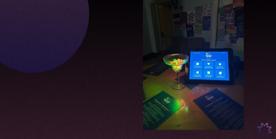
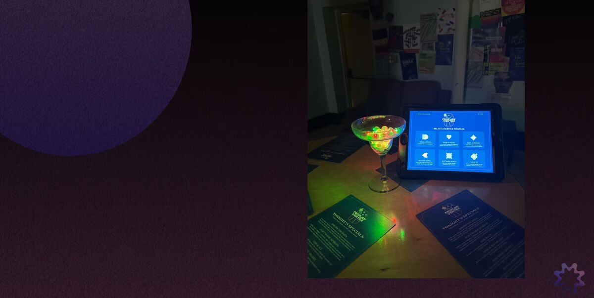
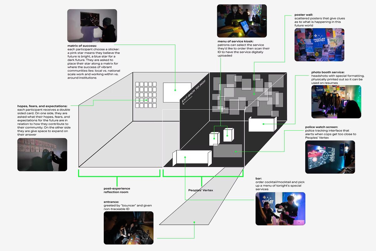
An interactive installation built for New Sun Rising, a Pittsburgh nonprofit. We designed an experiential future: a scenario where small nonprofits have been pushed underground, and People’s Vertex is the secret hub where they keep each other alive.
How do you make people feel what a nonprofit is up against?
How might we communicate the need to empower small community organizations to collaborate and thrive, despite significant pressure from government and institutional opposition?
Signals and drivers
We interviewed nonprofit leaders about what they hope for and what they fear in Pittsburgh’s future. The signals we found were local initiatives, elderly engagement, technological shifts, and tightening funding. Those became the reflective questions we asked participants afterward.

Building the future world
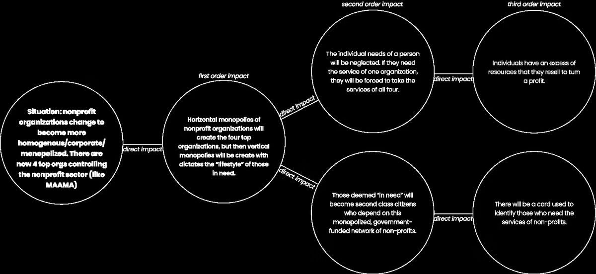
We committed to one scenario: nonprofits forced into clandestine, speakeasy-like spaces where people work around the rules. The world has its own details, like the tech acronym drifting from MAMAA to DADAA and climate migration reshaping the city, which is what made the room feel inhabited rather than staged.
Six artifacts, one world
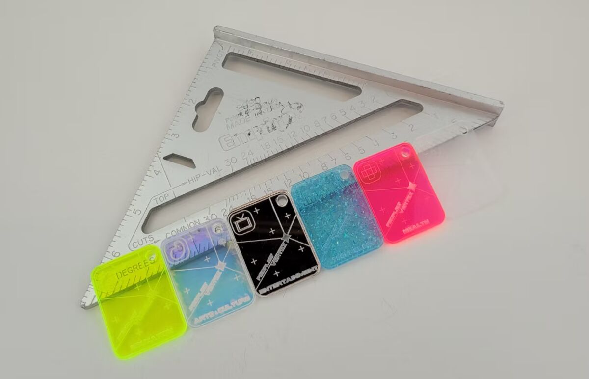
ID keychains
Participants got an ID modeled on a government-issued EBT card, carrying six sectors on one piece of plastic: health, education, technology, arts, culture, environment, and social work. You chose the identifications you cared about.
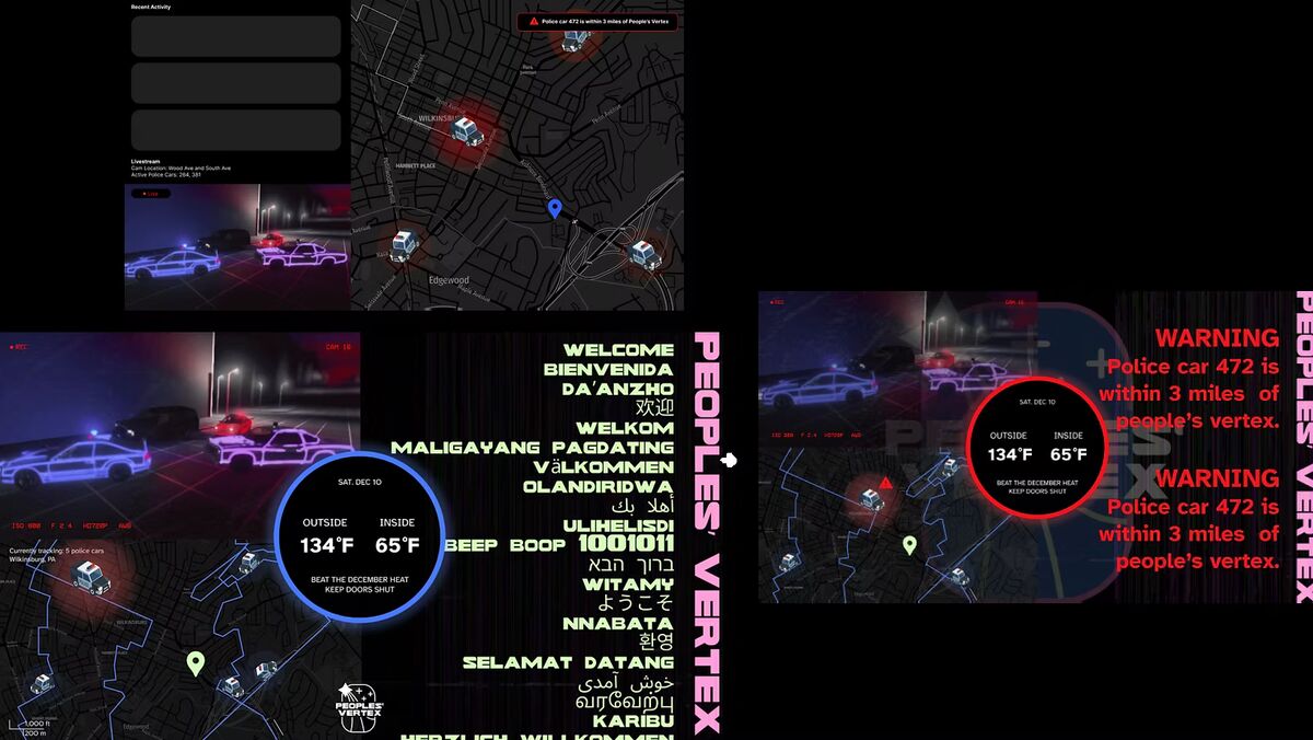
Police tracker
A security alert that warned of hostile entities nearby, doubling as a futuristic smart home panel. It read climate temperatures and raised an alarm when police proximity threatened the venue.
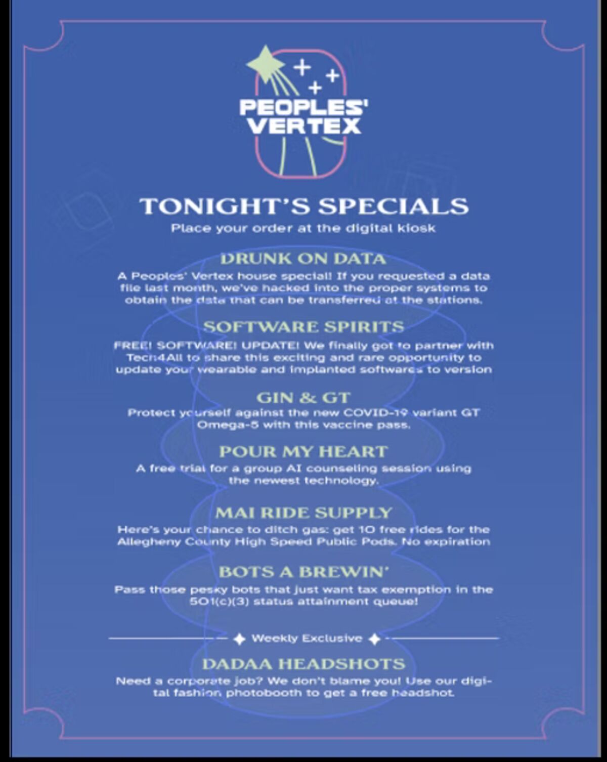
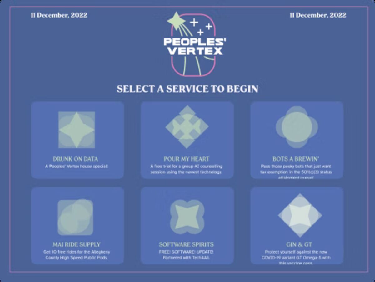
Menu of services
Digital and physical menus carried the speakeasy storytelling. Tablets ran a Figma prototype that guests drove with their ID keychains, and the services were personalized: scan your ID and the menu asked how you would bring vibrancy back to your community.
Posters
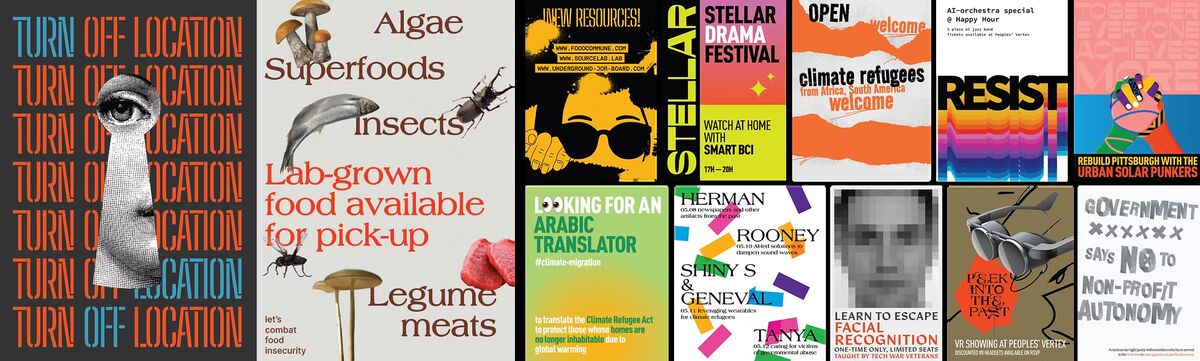
Outdoor posters warned visitors in somber tones and several languages to disable location tracking. Indoor posters sold the optimistic version of the future: 3D food printing, robotic child care, lab-grown superfoods. Hung eclectically, so the walls looked lived in.
Photobooth
A reimagined job search service. Underground, you could still get a corporate headshot.
Branding
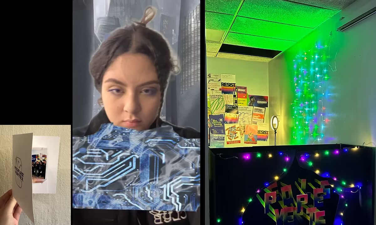
The identity had to travel from repression to hope. A grayscale, minimalist logo with playful edges, bold blocky type, and a palette of deep aqua, lime green, and neon pink for the speakeasy’s own diversity.

A gym, turned speakeasy
String lights and a large sign set the tone. Spray-painted boards split the room into People’s Vertex and the reflection room. Electro swing played underneath. Role play did the rest: we took on bartender, bouncer, and photo booth operator so participants had someone to be in the world with.
What participants told us
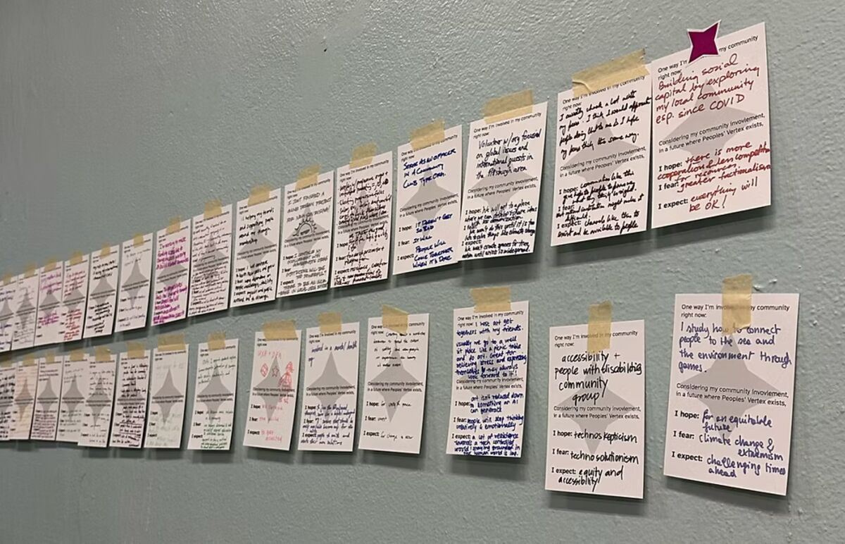
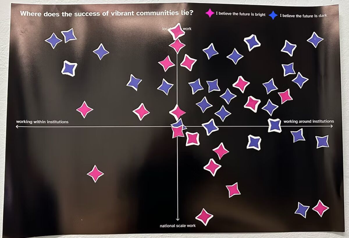
Two stations caught people on the way out. The first used pink and blue stars to read the room: most found the future dark, with the real work happening at local scale, around institutions rather than through them. The second used double-sided cards for hopes, fears, and expectations, which fed New Sun Rising’s own research.
Constraints stretched our thinking further than open briefs did. Narrowing to one specific future produced stranger, better ideas and much better conversations. We were never trying to predict what happens. We were trying to ask whether it should.
4RUN2
P3R runs Pittsburgh’s premier races, including the DICK’S Sporting Goods Pittsburgh Marathon. This project built the branding and sales strategy for 4RUN2, their in-house apparel line, with the Health & Fitness Expo during race weekend as the main point of sale.

Runners meet the brand too late to buy it
How might we grow 4RUN2’s online and in-person sales through marketing that starts earlier, and through the point-of-sale moments P3R already owns at its events?
Today a runner registers, picks up a bib, and races. Almost none of that touches the P3R brand or its products, and beyond the occasional email and a single website mention there is nothing else carrying it.
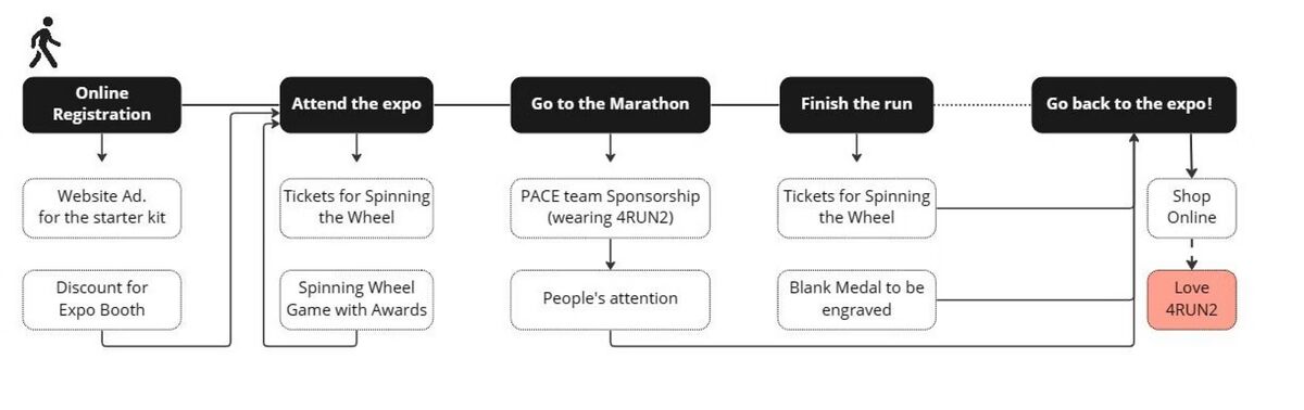
Redesigning the experience
Most runners discover the brand at the expo, which is far too late to turn into a purchase. The redesign introduces it earlier through starter kits, social, and a booth you cannot walk past.
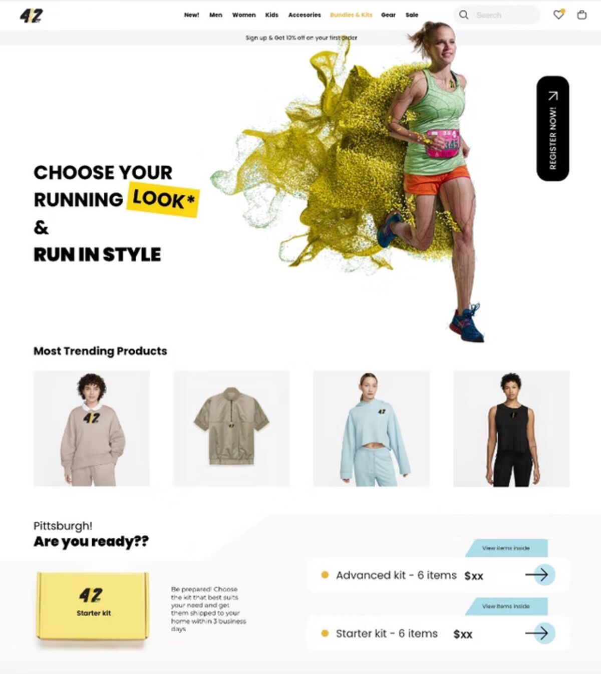
Registration and starter kit
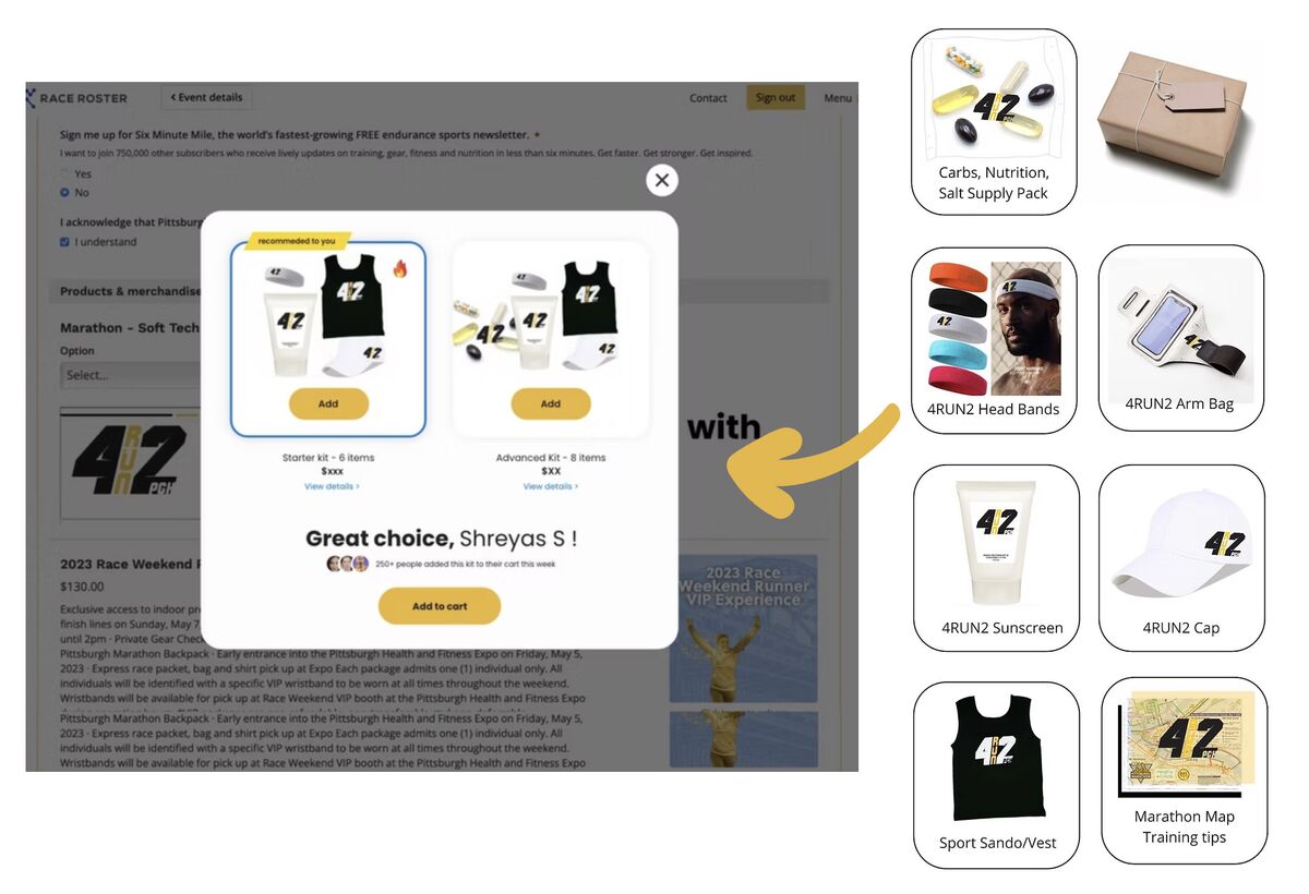
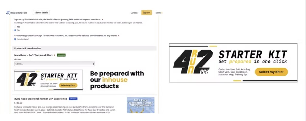
A package option offered at registration, with apparel choices, customizable colors and sizes, and room to add more to the kit.
Reach
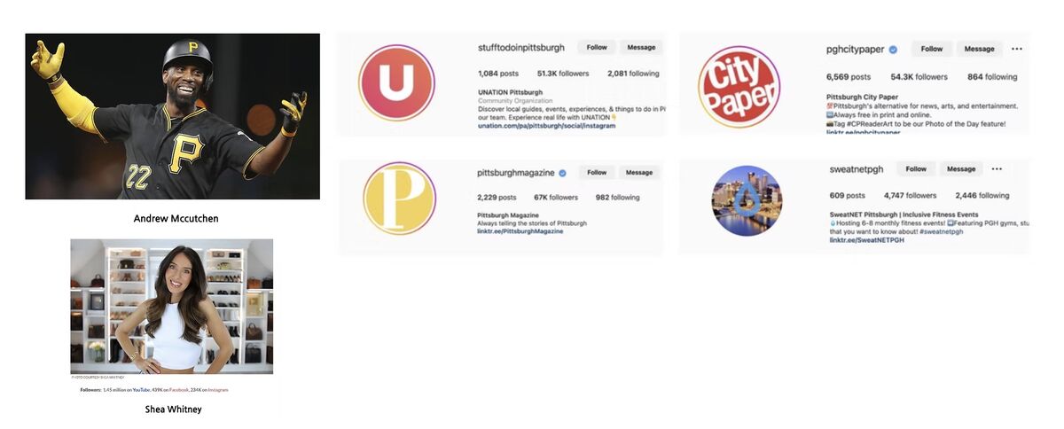
Partnerships were judged on three things: willingness to actually engage with 4RUN2, real passion for the products, and social following. Coverage runs March through May and June against targets for engagement, visibility, and sales, including a local tour through favorite pizzerias, the Carnegie International, and Steelers games.
Attend the expo, take something home
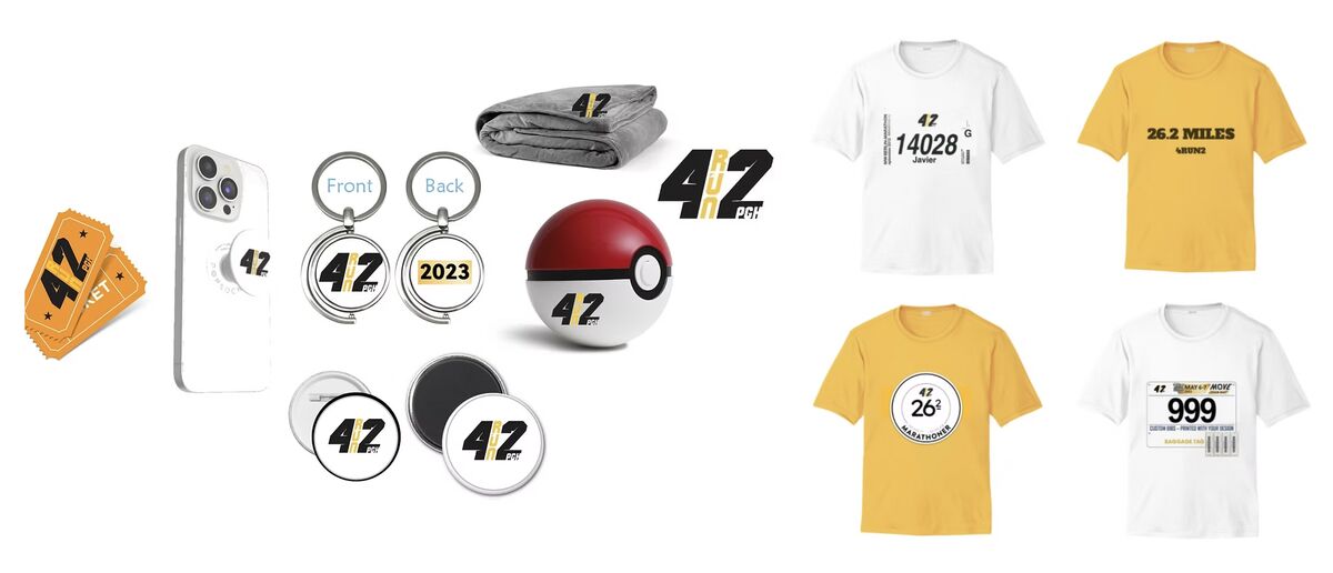
Runners and supporters leave with something: keychains, tote bags, or digital assets like brochures and branded wallpapers. Small objects, but they are what carries brand recall past race weekend.
One link, a lot of traffic
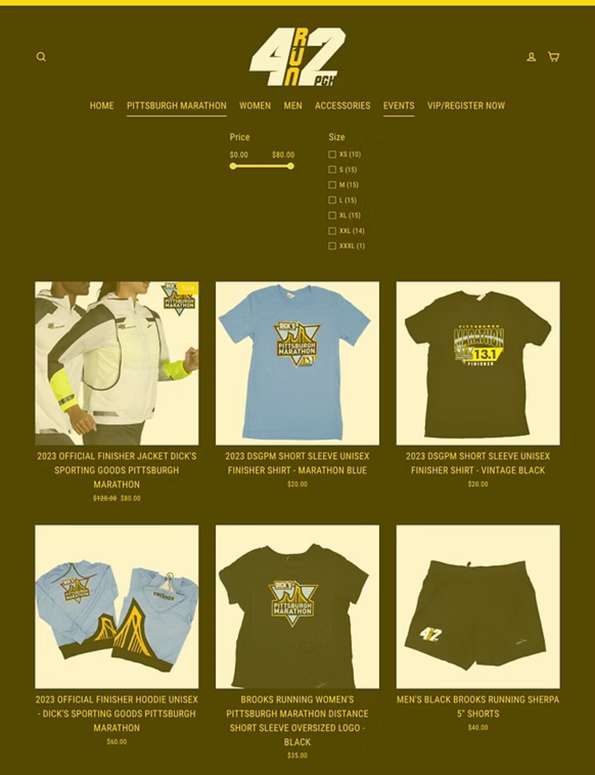
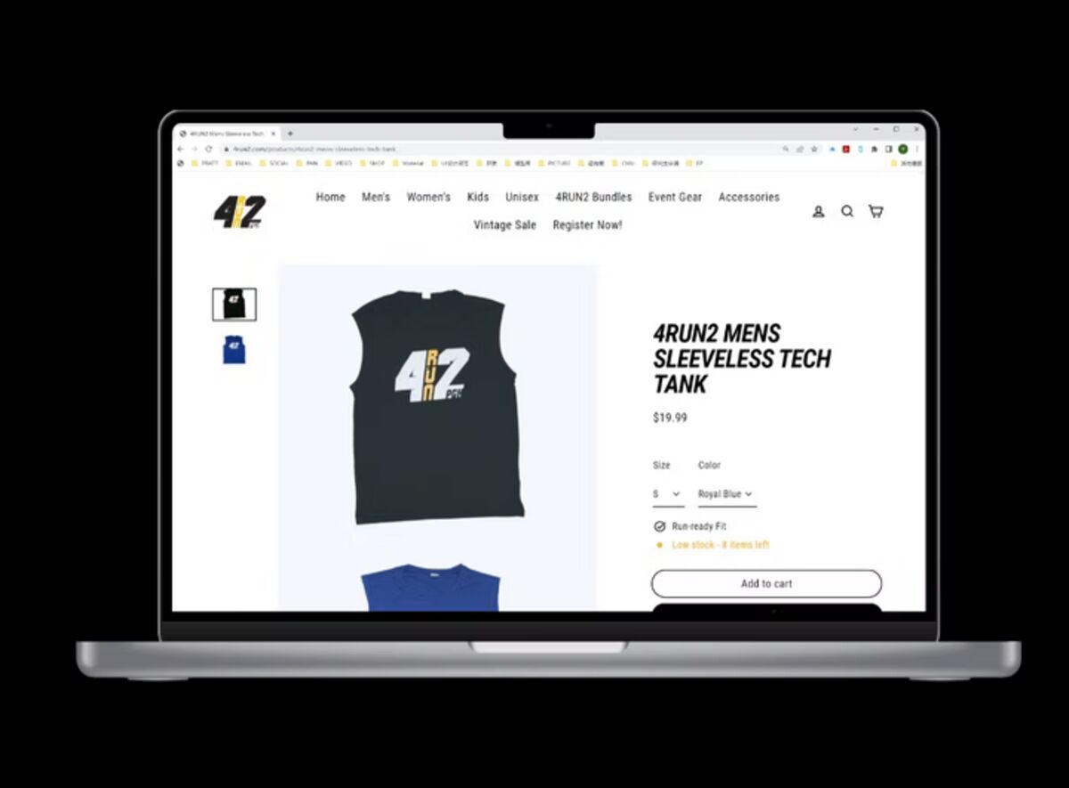
The Pittsburgh Marathon registration page links to 4RUN2 exactly once. Given the traffic that page already carries, the redesign uses it to position 4RUN2 clearly as P3R’s premium in-house brand and send people straight to shop.
To justify the price, the site had to look like it deserved it: a luxury, pride-driven aesthetic that signals quality through visuals, typography, and storytelling.
The buggy cart
An advertisement nobody expects, because it is actually useful. Supporters stock supplies and snacks at checkpoints, marathon tracking helps them arrive on time, and they follow their runner along the course instead of waiting at one spot or the finish. Two or three buggies carrying pace teams keep the middle of the race from going quiet.

Subject Line Assist
Klaviyo's AI wrote good subject lines, but only 1.74% of senders used it. I moved suggestions into the field people already type in, and adoption rose 7.4×.
Great AI. Nobody using it.
The AI subject line generator had been in the product since 2022. Almost nobody used it, because reaching it meant leaving the field you were typing in.
People don't write prompts. They write subject lines.
Across calls, tickets and a five-person prototype test, nobody handed off the writing. They checked their own line against the AI, or borrowed a keyword.
Users use our AI tool to either confirm “my subject line is better than AI,” or take keywords and phrases from their already-in-progress subject lines.
My note to the project channel, September 2024The feature expected a well-formed prompt. Nobody writes those. Real input looks like “10% black friday chocolate sale,” so I designed for keywords and stopped asking for the prompt at all.
Three concepts, five customers, one experiment.
I ideated wide, tested with customers, refined with data science and engineering, then let an experiment decide.
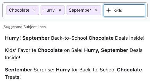
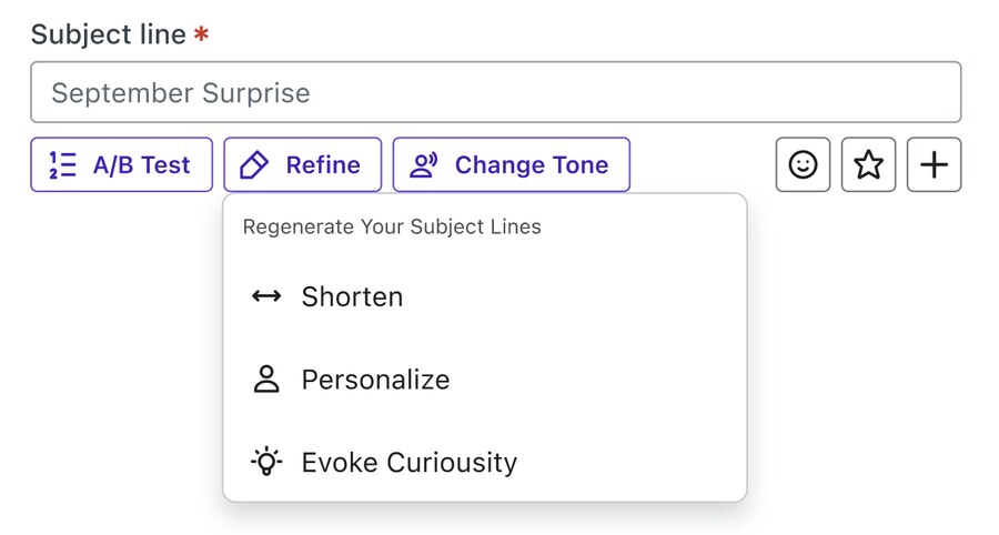
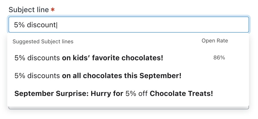
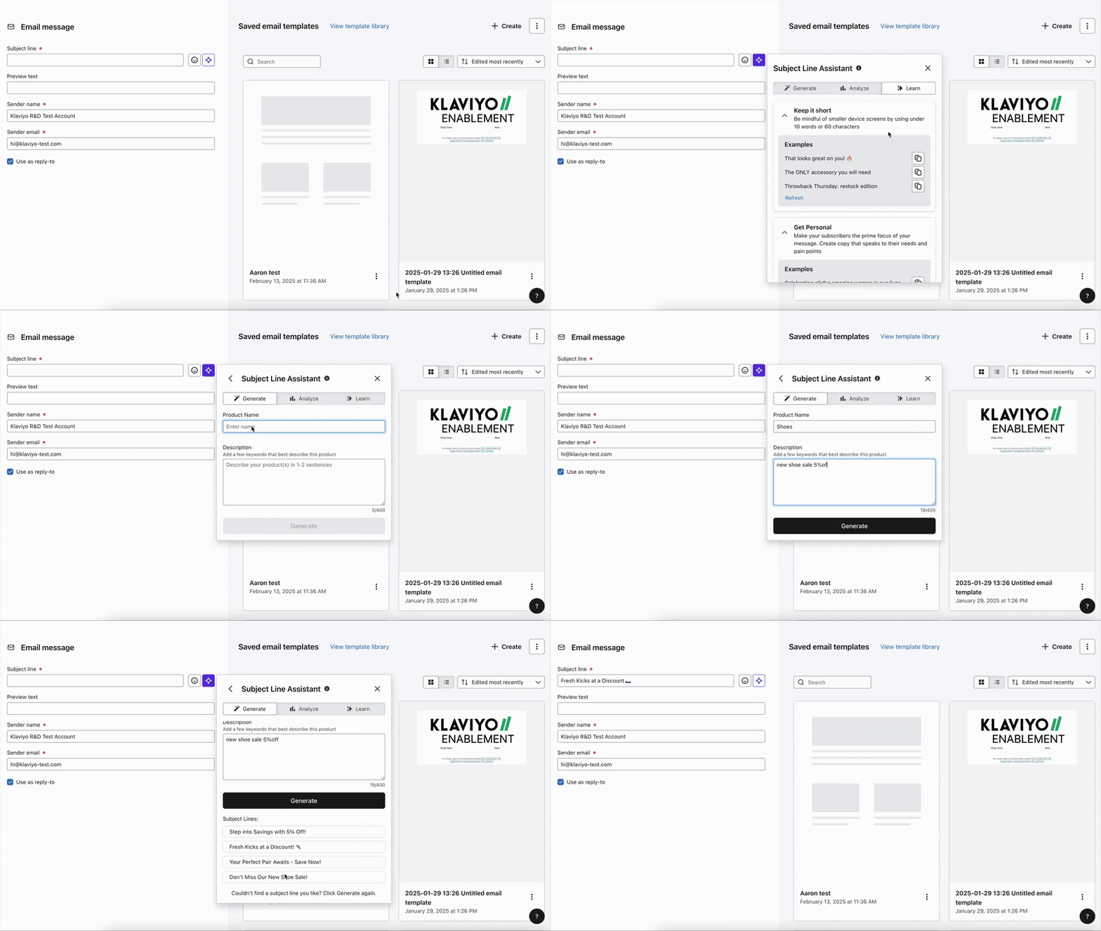
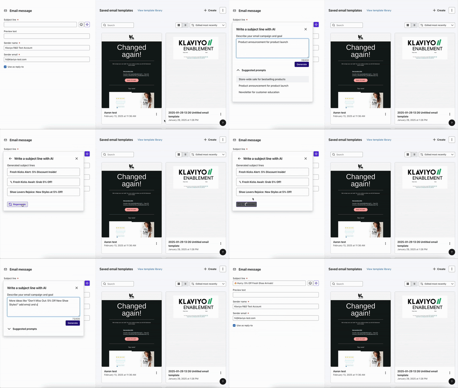
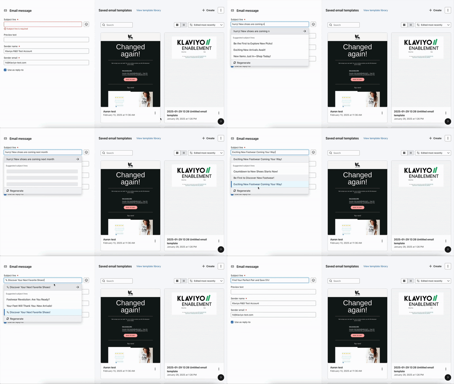
Side by side, the third is the only one where nothing has to be summoned.
The shipped design, in context.
7.4× adoption, and a guardrail that held.
Messages in the proactive arm that used no generation at all also improved, about 0.3 points. People took the idea and wrote their own line, which the adoption metric cannot see.
Brand Voice
AI drafts felt generic and “too much like AI.” I designed a system that learns a brand's voice from its own campaigns, then lets people edit it. Subject-line adoption rose 8.3% with no interface change.
Two jobs that contradict each other.
Drafts came out generic, so marketers edited by hand. The brief then asked for two opposite things.
“Drafts should sound like my brand, without me editing them.”
“Let me define and review my brand’s tone.”
In a four-person study, no one found the entry point, and no one recognized the descriptors as their own voice.
Six things in the way.
Eight findings, scored by severity.
Severity as scored in the report, January 2025, run with our researcher on two prototypes I selected. The top finding is the one I could not design my way out of: a system built to be invisible had succeeded.
The answer lives in a data model, not a screen.
Control isn't a mode you switch into. It's a silent escalation. The instant someone edits a descriptor, their words outrank the machine's inference for that field permanently. No settings, no toggle, nothing to discover.
A deadlock I was handed.
An engineer called it a UX question and tagged me. I brought a customer’s own words: they would expect to set this up once.
Teach the model with examples. Teach the person with labels.
The label is for the human, the body is for the machine. The name does nothing to the model; it exists so a person can trust the row. Examples are scoped to long-form only, since the subject-line path is high-volume and latency-sensitive.
A voice can't be inferred below a threshold of sent campaigns, so every new account hits a wall. I retrofitted this after handoff. It routes to the two manual paths rather than apologising.
Same interface. 8% more acceptance.
A pure backend experiment. 50/50 by campaign, ~637,000 messages, no visual difference between the arms.
| Metric | Control | Treatment | Lift | Verdict |
|---|---|---|---|---|
| Subject-line AI adoption | 10.00% | 10.83% | +8.26% | Significant · adj. p<0.001 |
| Average open rate | 34.92% | 35.00% | +0.17% | Not significant |
| Click rate | 1.61% | 1.62% | +0.30% | Not significant |
No new affordance, nothing to discover. Suggestions simply sounded like the merchant, and marketers accepted them 8% more often. The flat open and click rates are the honest counterpart: on-brand copy changed marketer behaviour, not recipient behaviour.
It also stopped being a feature. Built for one surface, it became a service for five, and ownership moved to the orchestration layer where teams inherit voice rather than build it.
The destructive override shipped. Uploading a style guide discards descriptors the user wrote. I'd now argue for merge-or-confirm.
The descriptor UI may do less work than it looks. An engineer thought the raw examples give the model far better context, which makes the editable list mainly a trust surface. I think he's right, and it isn't what I thought I was building.
The headline target was never measured. The requirements set 60% to 70% content acceptance, and no document reports whether it moved.
Personalized Send Time
Sends each message when that specific person is most likely to open it. I designed the scheduling UX, manual controls, and analytics that made marketers trust it.
One send time for a whole list. Would customers trust a smarter one?
Marketers picked one send time for every subscriber, whatever their time zone or habits.
We were sending everything at a hard eight a.m. … like what time is that in the U.K.?
Marketing lead, DTC brand · Customer callI put early scheduling designs in front of customers. The answer was a maybe, for two reasons.
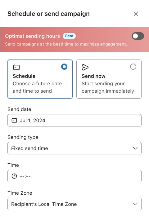 12
12I didn’t know this existed.Discoverability. A toggle inside the scheduling drawer is easy to scroll past.Led to the banner experiment
I don’t know if it works.Trust. Nothing showed whether the new timing actually helped.Led to the lift analytics
Is a banner the right pattern?
We ran an experiment: a prominent banner above the scheduler, or an option inline in the send-time dropdown. I bet on the banner.
The dropdown won because it lived where the decision already happens. No surprise element, just a better answer to a question the marketer was already answering.
Show the lift, and what it’s measured against.
Once people found it, the next question was whether it worked. The lift was real, but measured against a holdout nobody could see, so it read as an assertion.
I don’t need to know that. I don’t need you to tell me again the personalized send time works and break up all my data.
Marketing lead, DTC brand · Same callCustomers wanted more control over the baseline.
Trust brought a new ask: let me choose what it’s compared against. I added controls for the baseline and expanded the analytics to every campaign.
Control rate: 2.41%
Control rate: 16.9%
Control rate: 0.08%
1.8 billion messages, and an honest limit.
Under 50K emailable profiles, results are a coin flip.
Order rates don’t improve at any account size.
So the analytics only claim what the data supports.
Audience Optimization
A model scores every recipient at send time and drops the riskiest. The effect is real but tiny, so my job was making it legible.
The effect is real. It's also tiny.
Unsubscribes are rare: one to three in a thousand recipients. Even with perfect prediction, the pool the model can act on is a few people per send.
Not “communicate a big win.” It was: make a small, noisy, genuinely real effect legible enough to be trusted and kept. Everything good here follows from accepting that early.
The shipped metric was the least stable one.
The feature prevents a fraction of one unsubscribe per campaign. The dashboard reported the result for each individual send. Drag the account size below and watch what the product actually showed people.
The reporting surface wasn't just under-informative. It was teaching the wrong lesson to the people with the least patience for it. That reframed the whole project from explaining a model to choosing a unit of analysis.
I wouldn’t use any kind of audience optimization without thoroughly testing incrementality on performance. For me, I don’t really trust AI until I know it’s been proven.
Senior director of retention · Mid-market apparel brand · research sessionBoth rates. Every funnel stage. A designed “we don't know.”
Control rate: 0.214%
Control rate: 41.2%
Control rate: 0.041%
From near zero to a third of campaigns.
Removing is safe. Adding is not.
The next milestone inverts the feature: instead of removing recipients, it adds them. Removing the riskiest one percent is safe on any audience. Additions are large, they're the brand's most valuable profiles, and they only mean anything relative to the campaign they land in. Drag the campaign size to see why.
People don't experience an addition as a decision. They experience it as a segment. One participant wanted the added profiles given their own name so she could see how they performed after the send, which turns this from an explanation problem into an audience-composition problem.
Channel Affinity
A model predicts which channel each customer will actually engage with: email, SMS, push or WhatsApp. I led the UX for profile attributes, segmentation and flows.
Channel selection was guesswork.
About 10% of Klaviyo customers send on more than one channel a month, with no signal for where each person will engage. SMS costs money per message, so without data, picking a channel is guesswork.
The same message on every channel at once reads as spam.
People don’t want to receive the same message through both channels at the same time.
Every text costs money, even to people who never answer.
We want to send SMS to people who really need it.
Unsubscribe from email and stay on SMS, and nothing adapts.
We’re operating within a silo, blind to those unsubscribes.
The savviest built their own preferred-channel property from flow logic. It does not scale.
Eleven customers, a lot of confusion.
I ran eleven 1:1 interviews, SMB through mid-market, to test whether people understood the model and could apply it. Four things came back.
- Email, SMS and push engagement
- Site activity
- Recency and consent
- Segments
- Flows
- Campaigns
A rank on its own is misleading. Someone whose top-ranked channel still has low predicted engagement looks identical to a genuinely reachable customer, and a simple “preferred channel” label would send you after both. Rank gives you the direction. It does not tell you whether the signal is worth anything.
Same model output, two labels. The first one tells you to send Dana an email. The second tells you Dana barely engages anywhere, so the right move is to leave her out of the expensive send entirely. Two properties instead of one is the whole design.
Two properties. Three surfaces. One data model.
Two ordinary profile properties, which is why they work in surfaces people already knew. Nothing here is a new object type or a new builder.
It routes well. It does not beat everything.
It wins inside the channel it picks, but email-only still had the highest overall engagement.
So “route everyone to their best channel” isn’t proven yet. That shaped what came next.
Discount Decisioning
A model that tells you who has historically needed an offer to buy. It is pre-launch, so the work is not public yet.
This one is still in design toward a limited beta, so I have taken the detail down for now. Happy to walk through it live: the uncertainty states, the claim discipline in the copy, and the research behind asking someone to withhold a discount.
Data XRay
Athenic lets business teams analyze data in plain English, with no SQL and no data team. The AI worked. People signed up, got confused, and left before they ever saw it work. I led the end-to-end design to make the promise feel real.
Powerful AI. Nobody could use it.
Users signed up, got confused, and left before experiencing any value. Not because the AI failed, but because the experience around it got in the way.
Fewer features. More clarity.
Rather than adding analytical power, I worked on instructional design, discoverability and conversational continuity. I ran a whiteboard session with engineering to map what the system could actually do, and to decide what to build first.
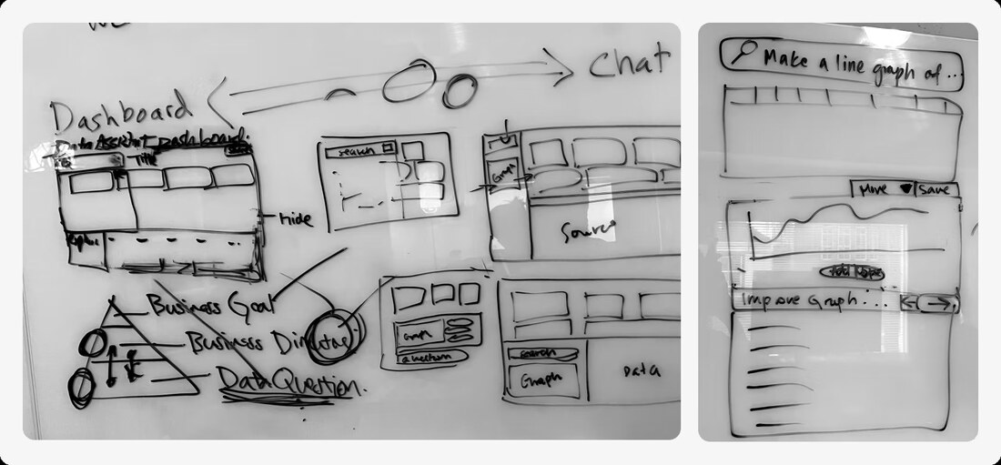
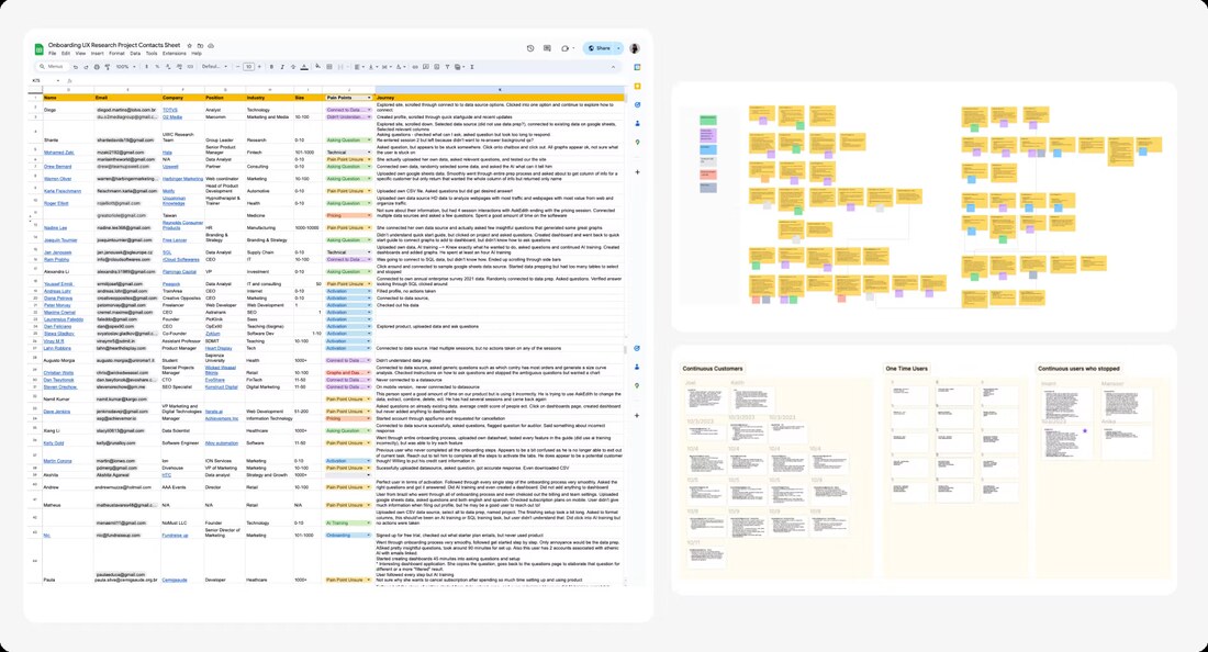
Over twelve rounds of user testing I worked through four product directions before converging.
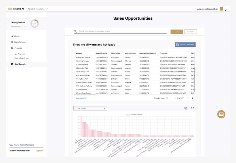
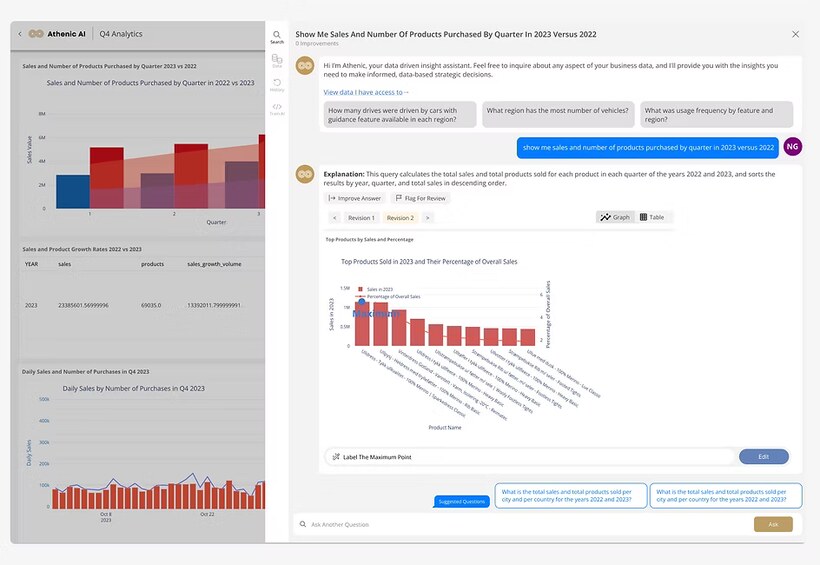
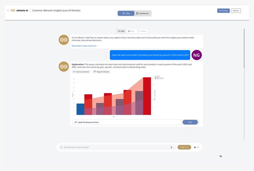
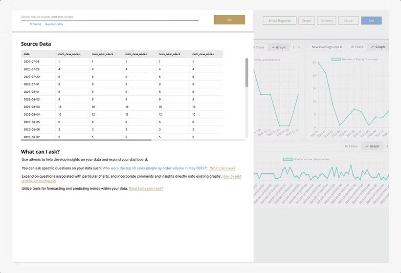
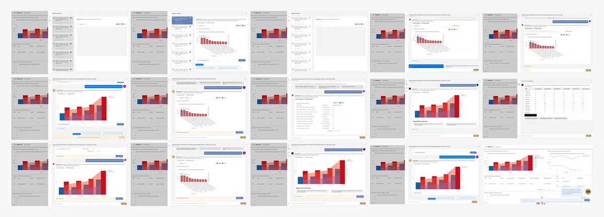
People did not need more analytical power. They needed clarity, guidance and continuity. The constraint was never the AI. It was the experience around it.
Ask. See. Remember.
Chat, charts and saved insights in one workbook. Ask a question, see the answer visualized, and build on it without losing your place.
The backend takes a while, so instead of a spinner the interface narrates the work: it pulls the tables first, then draws the graphs, and shows where the data came from. The wait became the moment that built trust rather than the moment people left.
Insights build on each other instead of starting over every time, which is what turned a demo into something people came back to.
Easier to start, so more people stayed.
Powerful AI is only worth something when people understand and trust it. Reframing analytics as a conversation let non-technical teams work with their own data, without an analyst in the room.
LMS Canvas
Students juggle a dozen tabs to finish one assignment. I led research and design on a single workspace that keeps every source in view.
Most universities use Canvas. Students still struggle with it.
34% of US universities run on Canvas, 43% of its users call submitting assignments their top frustration, and 800+ learning platforms are competing for the same students.
Where is the frustration coming from?
I spend more time finding, formatting and checking my assignments than actually doing them. Half the time I miss a deadline I didn’t even know existed.
Katie · MBA student · full course loadHow do students use an LMS today?
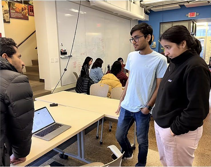
We ran a co-design session to watch students finish a real assignment, end to end.

Jobs to be done: the most valuable ones were also the hardest.
We broke submission into jobs to be done and plotted every one by value and effort. The design target is the lower right: jobs students value most that still take the most effort.
The task, summarized.
Eight stages to submit one assignment, and most of them happen outside the assignment page.
- Pending assignments
- Due date
- Estimate time
- Prioritize
- Assignment
- Details
- Team
- View requirements
- Review notes
- Prepare equipment
- Find a place to work
- Review requirements
- Internalize the rubric
- Realign with instructor and TAs
- Do the assignment
- Format
- Assign a submitter
- Requirements
- Verify format
- Due date and time
- Edit if needed
- Request extension or feedback
- Format submission
- Submit
- Verify submission
- Resubmit if needed
- Add materials
21 opportunities, narrowed to one question.
From sketches to a tested direction.
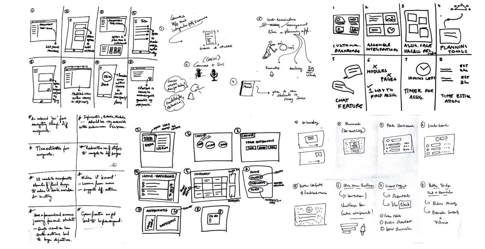
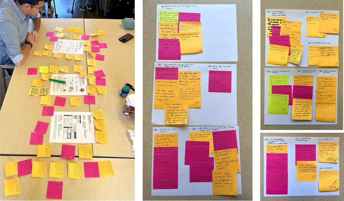
We ran Crazy 8s, narrowed the sketches to three concepts, and let students’ sticky notes decide what stayed.
Create a workspace, then never leave it.
From any assignment, students pull the prompt, rubric, lecture and notes into one view, and pick up right where they left off.
Concept posters
Due Sun 11:59 PM · 100 pts · File uploadNew workspace
Pick what you need for this assignmentNext: a workspace that isn’t limited to one screen.
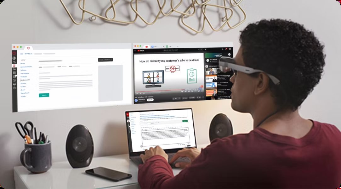
Looking further out, the same workspace moves off the laptop. With AR glasses, the assignment, lecture and notes float around the student, so every source stays in view without fighting for space.
SiteMatch
Affordable housing developers spend months evaluating sites by hand, without data. SiteMatch surfaces the best ones by estimated funding score, so developers can find a site and secure the money faster.
A process built on guesswork and regulation.
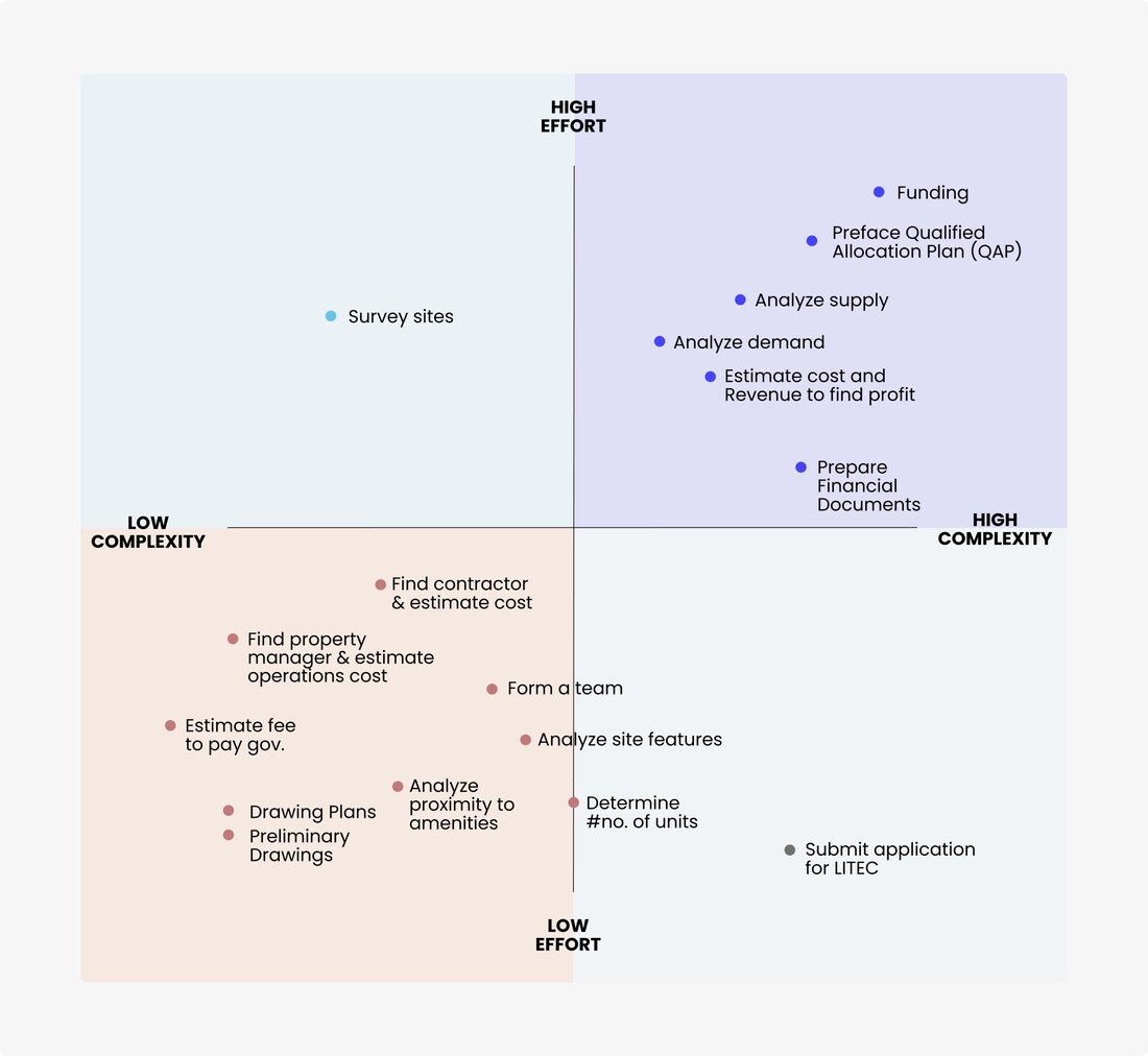
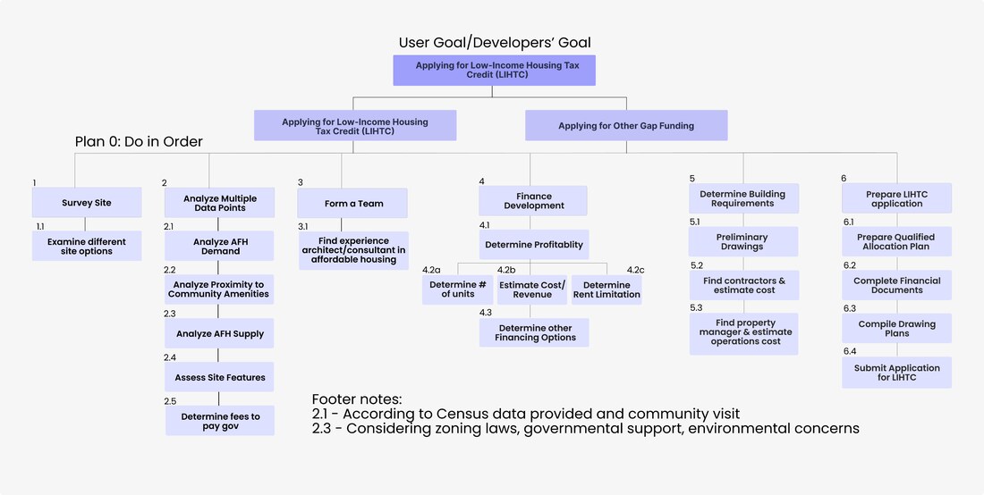
Affordable housing developers win tax credits through the Qualified Allocation Plan, a government score where higher means a better chance. Criteria differ across fifty states, policies keep shifting, and data is scarce, so scoring accurately at speed is nearly impossible.
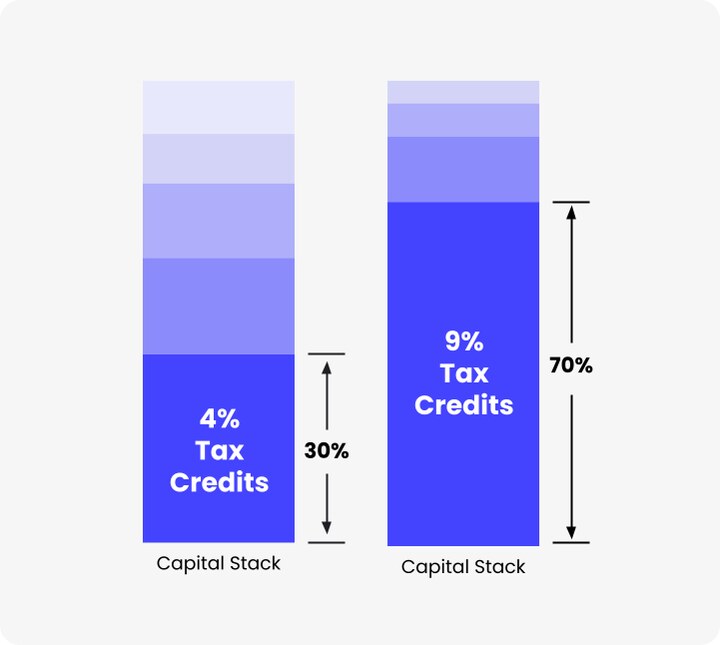
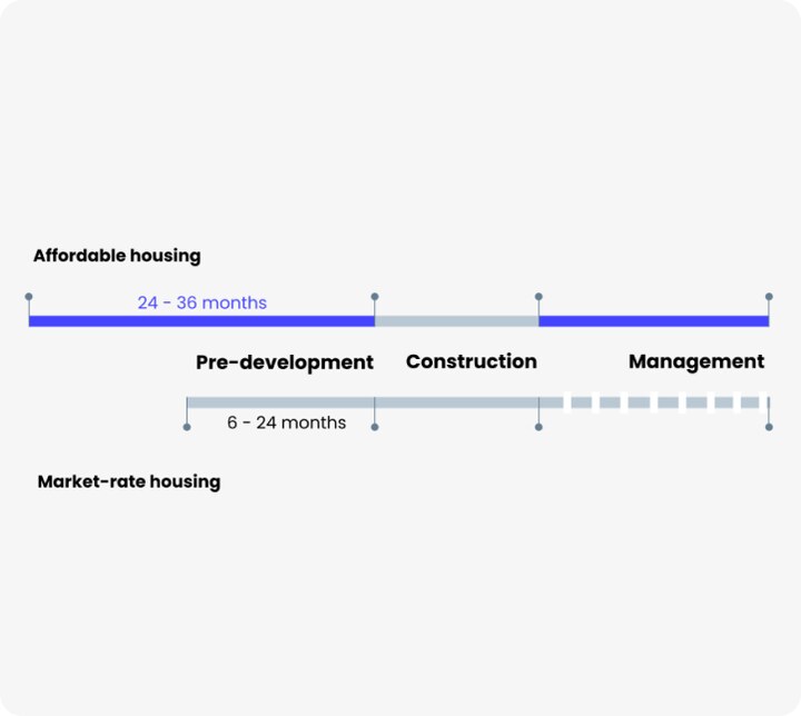
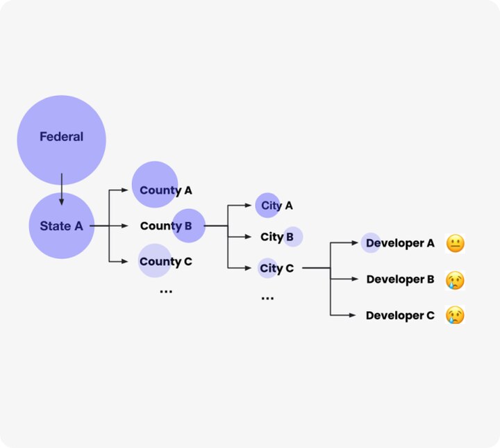
Ten expert interviews. One clear opportunity.
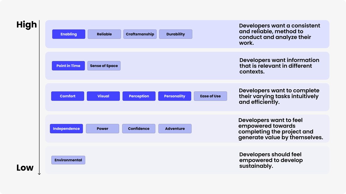
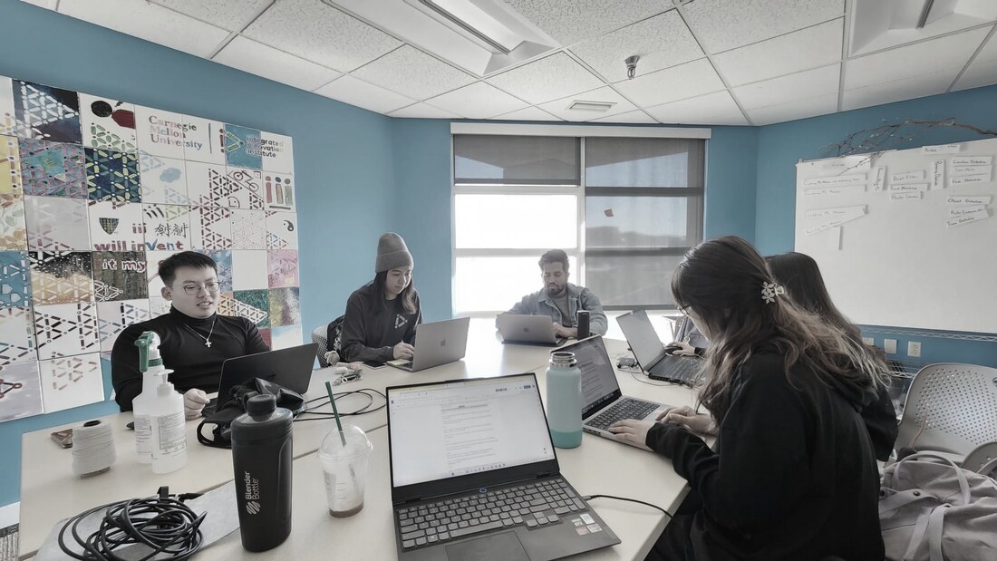
We interviewed developers, architects and consultants working in affordable housing on the East Coast to find where the real friction was. The answer was site selection. There was no reliable way to identify and evaluate sites against the funding criteria, so people did it by hand.
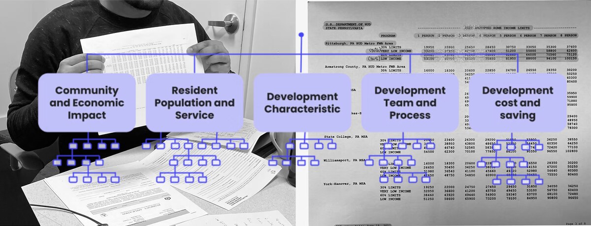
Three concepts. One winner.
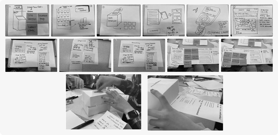
After a build-a-thon with Crazy 8 ideation and physical wireframing, we converged on three concepts, each attacking the problem from a different angle.
Find the right site. Score it. Win the funding.
One place for reliable, integrated, current site information, organized around the decision developers actually make: which site gives them the best shot at funding.
SiteMatch product demoSearch, score and compare sites, end to end Watch on YouTube ↗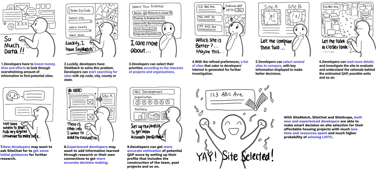
Value delivered.
SiteMatch cuts pre-development time to under twelve months, centralizes site data that was scattered across sources, and gives developers a clear path to maximizing their score and their chance of winning funding.
Experience level shapes everything. New developers want simplicity; experienced ones want their existing workflow respected, and those are different products.
Show deliverables to users as early as you can. In complex B2B the knowledge gaps are wide and the data gets messy fast, so you pivot, prototype, co-design and workshop continuously rather than designing then validating.
The Personalization System
Marketers wanted simplicity and optimization. We gave it to them in six different forms, built years apart. I wrote the patterns that made them feel like one thing.
Marketers wanted simplicity and optimization.
They wanted fewer decisions and better results. We shipped exactly that six separate times, each built years apart and unaware of the others.
A marketer meeting these one at a time has no way to tell they are the same kind of decision.
Dots mark the ships I worked on. Discount is still pre-launch. Nothing here was designed with the others in mind.
The layer got one name. Every feature under it kept its own. Survey data showed customers didn't connect audience optimization to personalization at all, so the rebrand could not stop at the pricing page. It had to happen in the product, on every surface where a model already made a decision.
| Surface | Called | Marked with | After |
|---|---|---|---|
| Send time | Personalized send time | Composer sparkle | Personalized |
| Audience | Audience optimization | Nothing | Personalized |
| Content | Advanced personalization | Sparkle in a status badge | Personalized |
| Product recs | Varies by surface | Varies | Personalized |
| Channel affinity | Channel affinity | Nothing, and free | Personalized |
| Smart sending | Smart sending | Nothing, and free | Personalized |
The sparkle was the worst offender. In the composer it means generate this for me, the mark for content generation and the AI assistant. Reused on send time, it told people a model had written something when a model had only chosen a time. Generation and prediction need different marks.
The same indicator goes on free features as on paid ones. Customers couldn't tell a model was involved at all, so the badge says a model decided this, not you paid for this. Put it only on paid features and it becomes a price tag. Entitlement belongs in gating.
The blocker is explainability, not accuracy.
Sixteen power users, five sessions. Trust splits along data-driven versus generative. All sixteen accepted send time, predictive metrics and audience optimization. All sixteen refused to let AI write customer-facing copy unreviewed.
I have it running on two different flows. On one, the personalization is crushing it. On the other, it’s sucking wind, and I’ve got literally no why.
Agency strategist · AgencyTwo things changed priorities. Defaults decide adoption, because the controls sit below the scroll line. And the dashboard is glance-once, so the real ask was an alert when something underdelivers.
The pattern library is the real contribution.
A model is confident, borderline, inconclusive, or still learning. Design systems have no pattern for that. I wrote three.
The type ramp does the work, so a scanner knows how much attention a number deserves before reading a word.
Lift-only was the least trusted thing I tested. One participant called it “almost on instinct a little bit scammy.” Five of six trusted the full comparison, which disproved my own hypothesis. Verifiability comes before trust.
Then consistency created its own bug.
Turn both features on below.
Two identical bolts, caused by finally making everything consistent. Fixed in code: one badge, one tooltip, one assembled screen-reader string.
Consistency is not a one-pass job. Sharing a pattern creates collisions that exist only because it is shared.
Engineering wanted a new personalized status variant. Design systems said no: personalized is an attribute, not a status. They were right.
Why these six belong together.
It was never six features. It was one question asked six times: when a model decides something a person is accountable for, what does the interface owe that person?
Show the comparison, not the conclusion. Give uncertainty a designed state. Remember the person’s control. Claim only what the data supports.